Fairstyle
Website

The goal
For this job I set out to provide an improved user experience over the previous iteration of the site, with a focus on responsive design and ease-of-use for content authors. Further, I was to maintain as much of the existing brand and design as I felt appropriate.
The experience
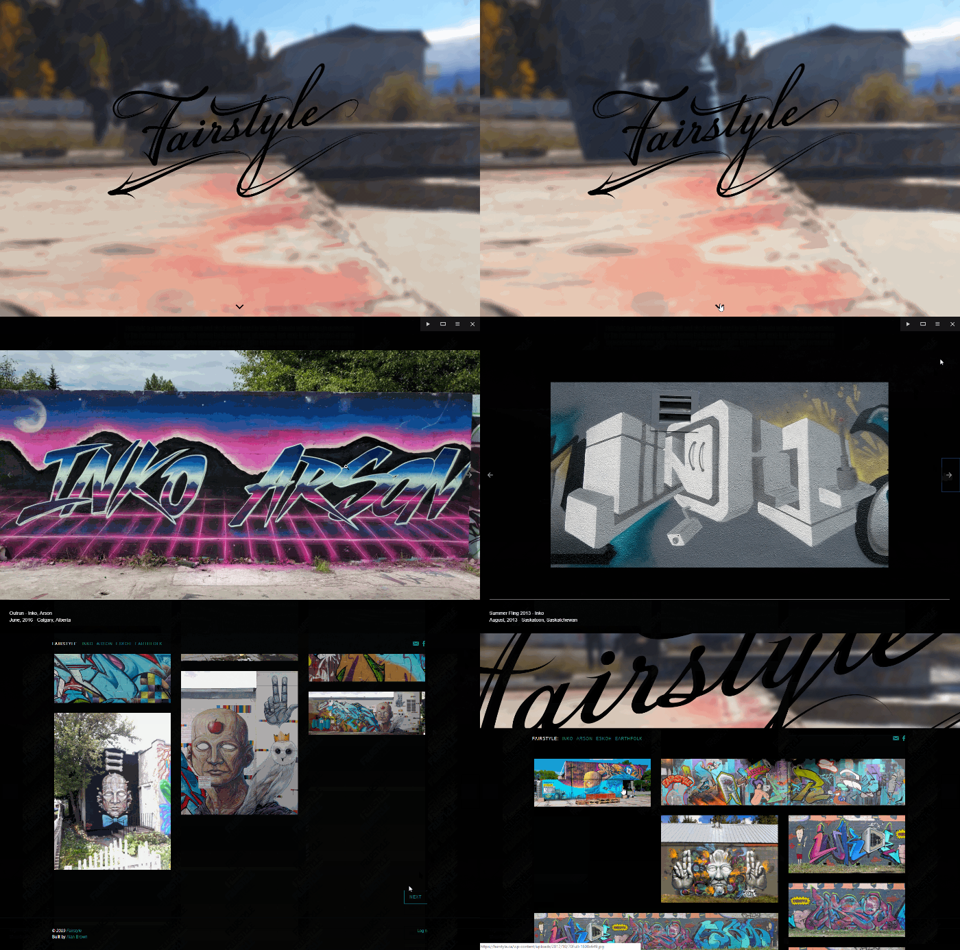
This was a fun and exploratory project, where I was supplied with a wealth of great source material in video, photo, and existing design assets. I decided to use a masonry style layout to support the wide variance in photo aspect ratios.
The outcome
Overall an extremely positive outcome. The site is beautiful and intuitive with a simple, responsive design. The authors find it easier to manage content, and our analytics indicate that users find it easier to consume content in paginated format.


