Checkfront
Website

The goal
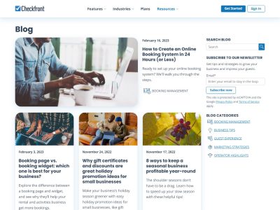
Checkfront’s previous website was getting the job done; they already had a wealth of SEO rich blog content, and a decent enough handle on conversions, but they knew that there was more left on the table.
The main drive for the rebuild was to provide a scalable and future-proofed solution, tailored to deliver on their upcoming initiatives. This meant ensuring that the site would be fully translation-ready, WCAG Level AA accessible, optimized for performance, always running the latest and most secure version of WordPress, and leveraging the native WordPress editor experience, eliminating needless bloat introduced by 3rd party builders.
Part of the initiate was also to modernize the design and UI. I worked closely with designer Chris Stewart to conceptualize, prototype, design, and A/B test the new UI before moving forward on the full build. Further, Checkfront also wanted a mechanism for simple and ongoing Conversion Rate Optimization, to ensure design and content decisions have the desired effect on conversions.
Finally, improved content management was a core tenet of the project. The content data needed modelling and structure to provide control over nearly all of the content from within WordPress with little or no developer involvement. The project also needed a vast content audit and removal of stale material from the prior 10+ years of content creation on the platform.
The experience
Suffice it to say that this project pushed me to new limits in almost every capacity. To begin, I needed an easy developer experience that supported multiple developers and QA analysts to run the project locally from a simple, reproducible Docker environment. This was my first time working with Docker, so I dove in, and with some assistance from Checkfront’s DevOps team, was able to deliver a Docker container that can be deployed into Checkfront’s infrastructure through the CD pipeline. On top of that, build time is down 75% from the previous project.
I wanted the project to use a modern front-end workflow, so I settled on using Roots’ Sage as a starter and built a custom theme from it. This affords the use of modern tooling like bundlers and compilers for our assets through Webpack. It’s a well-oiled machine that makes development smooth, and assists in performance optimization.
Careful consideration was given to the project’s architecture to ensure maintainability over the long run. The custom theme exists to handle the presentation layer, while functionality is all managed through a series of Must-Use plugins on the site. This ensures that visually the site can be updated with a new theme without any disruption to the functionality of the site and the model of the data.
This was my first project where accessibility was a significant consideration. The process was involved. I first audited the site with tools to identify WCAG Level AA accessibility failures, and solved for all of those. I then manually navigated the site using only a keyboard, and then a screen reader, and solved for all errors identified through those audits. Finally, we sent the site out to a 3rd party for an audit and solved for any oustanding failures they uncovered.
This site furthered my experience with a component-based workflow leveraging the native WordPress block editor. Instead of page templates, the site empowers content authors to use whatever blocks (or components) they feel is best suited to the content. Where components are required outside of the scope of the native block editor, I build custom blocks.
The outcome
The site went live in June of 2021 and introduced significant improvements to the project. The site is much faster, ensuring that assets are optimized and are only being loaded when needed. The site also uses a simple solution for CRO which allows for experiments to be easily run and evaluated. Content management is more empowered and creative than ever before, resulting in some striking and creative material. Strong accessibility is maintained, ensuring the site is accessible to as many users as possible.
Most importantly, the project is under constant iteration. As we discover new ways to improve and grow, we embrace that in agile fashion and iterate on our existing solution.
Finally, the site has shown considerable SEO improvements, with a steady increase in organic traffic since launch.


